

Responsive web design is a method that provides advice, in the general sense, based on design and development platforms, screen size, orientation, behavior, and response to the environment. This system consists of intelligent use of layout and flexible grid, CSS media queries, and images.
When users switch from laptops to iPad, websites should actively switch to match image size, resolution, and scripting capabilities. After switching to settings, you may have to consider or use VPN if the device can't access the webpage right away.
You may have to deal with problems. When designing web pages, it is recommended that they have the technology to respond to users' preferences automatically.
What is adaptive web design?
Adaptive design means adaptive graphical user interface (GUI) design or adaption to different screen sizes. Different designs typically use multiple specific layout sizes while the system identifies the size of the browser so that the system can select the most suitable layout for the screen.
Adaptive web design is a tailored system that can fit any screen size. This wen design system has several layouts, enabling you to select the desired layout for different screen sizes manually.
One of the advantages of adaptive web design is that it allows the designer to choose the layout of their choice, and it will enable the GUI to be displayed optimally on any of your devices.
What is the difference between responsive and adaptive web design?
While there is no significant difference between adaptive web design and responsive web design, this adaptive web design can match the size of any device due to its large number of layouts.
The difference is that content-adaptive designs follow a certain format or size. In contrast, responsive design moves dynamically. Due to a large number of layouts of adaptive web design, it can select the best layout for any device's screen and give a single layout of responsive web design, for which the system chooses the layout according to the screen size of the device.
Adaptive web design is an ideal follow-up for those who are regular or professional designers. Adaptive web design has about 6-common screen widths or pixels used to create a web design.
Adaptive web design is expensive because the designer has to create six GUIs individually, using a single layout in the responsive design, so the cost is a little less. If it is seen that there is some difference between adaptive and responsive, then both of them are required in different fields.
Why is responsive web design important?
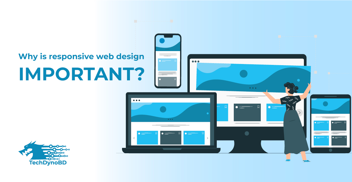
Here are the reasons why responsive web design is essential.
- Make your site more accessible:
The primary website traffic comes from individual or separate searches. When users can easily search your website, and the website is accessible on all devices, you will enjoy lead conversion, lead generation, and many other benefits. In other words, responsive web design makes it easier for people to shop from different websites and increases the website's user-friendliness.
- The website allows for quick updates:
Responsive web design is a single version web design. Once you enter the information here, it will be updated quickly and keep running. It is a platform where people buy and sell on any buying and selling website to save cost and time. This web design is essential if you want to get sales very fast.
- It helps to boost search engine optimization (SEO):
SEO is search engine optimization. Google ranking algorithm supports most of the most responsive website designs. These types of website designs can usually rank quickly in local areas. Google brings together many websites, indexes, and ranks the most responsive websites, so the role of responsive web design for website SEO is immense.
- Everything is easy to manage in responsive web design:
A single responsive web design system can easily attract users and correct any errors and mistakes easily. If there is a single responsive web design system, you can easily take all the management tasks forward.
Managing separate websites for PC and mobile users requires confusing effort and time. Having different sites for different device users results in higher website costs which is costly, without paying too much for other sites. It is considered more appropriate to invest in a single responsive site.
- It can further enhance the online user experience:
A responsive web design offers a variety of benefits to users, including a responsive design and security for which the user gets a premium benefit. Useless pop-ups, baseless text, or irrelevant images may confuse the user, but these problems are not noticed when you have a responsive site, and the user gets all the information very easily.
- Allow Promote Link sharing on multiple devices:
Responsive web design sites must be much more up-to-date. If a link from a mobile device to a responsive web design site is shared with another device, that link will automatically adapt to the device's layout, and the users will find all the information on the first page of the site. An unresponsive website link is considered utterly useless for a mobile device user.
- It allows the creation of mobile segments:
You can create a mobile segment through responsive website design, which will enable you to easily view all the information or analysis contained in your responsive website from your mobile device in online management from anywhere in the world. It is an important feature that has helped many small business owners in their strategies.
Best responsive web design testing tools
There are many responsive web design testing tools for you to check your site's mobile status. But the best one is Google's mobile-friendly test. Just enter your site's URL in the box, then Google will analyze how your site loads on mobile.
Another tester of Google is Page Speed Insights. Enter your website link into the box here. Then Google will check your site's text, and graphics and will be able to check the page loading speed on mobile devices.
Final verdict
It is no longer a secret that today's young generation is more inclined towards mobile devices, and the tendency to browse through PCs has decreased a lot. Statistics show that the trend of using mobile phones has increased at a significant rate.
We have shown the difference between adaptive and responsive web design in the discussion above, and responsive web design is one of the most suitable.